


When it comes to interior design, colour is fundamental. However, if the colours complement the room, the most important thing is how they make you feel. For instance, blue is a calming and soothing colour that can make you more relaxed, while red is vigorous and not everyone is comfortable spending a lot of time in a room with red walls. Pink is a great colour if you want to make the room a bit more playful and girly.
Colour psychology implies that colours can affect your feelings, thoughts and actions. If you’re trying to spruce up your living room or bedroom, and aren’t sure how things would work, you can always start with something temporary. For instance, if you’d like to add some blue colour in your bedroom you can use blue wallpaper for walls.
If you aren’t working with an interior designer and want to do this project on your own, here is a detailed explanation of the basic colours people use for their walls.
What Is Colour?
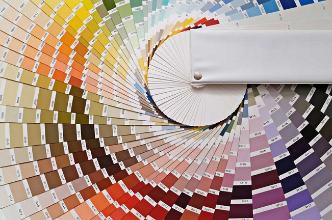
In physics, colours are the ways our eyes and brain perceive various wavelengths of lights reflected off objects. The rainbow represents the spectrum of colours that the human eye can see. The primary colours are red, yellow, and blue. When combining these hues, you can get every other colour. When trying to integrate some colour into your home, you can use a colour wheel where you can find many more tones besides the primary ones.
Colour Wheel
There are a few basic things you should become familiar with before adding colour to your interior design.
Complementary Colors – These hues are directly opposite to each other on the colour wheel. For example, blue and orange or yellow and violet are total opposites. Complementary colours are used as accent colours in small amounts.
Triads – They form a triangle on the colour wheel (yellow, blue and red; orange, green and violet). These colours can be used as accent colours; if they aren’t balanced, they may easily become tiring.
Analogous – These are groups of colours that stand beside each other on the colour wheel (red, orange and red/orange).
Monochromatic – This is just one colour where you can check shades from light to dark.
Cool and Warm Colors – These are typically used to set a mood in a room. Cool colours are purples, greens and blues, while warm ones are reds, oranges, yellows, and pinks.
Non-Colors – You can’t find these colours on the colour wheel, but they play a very important role in interior design. These are the greys, beiges, browns, whites, and black.
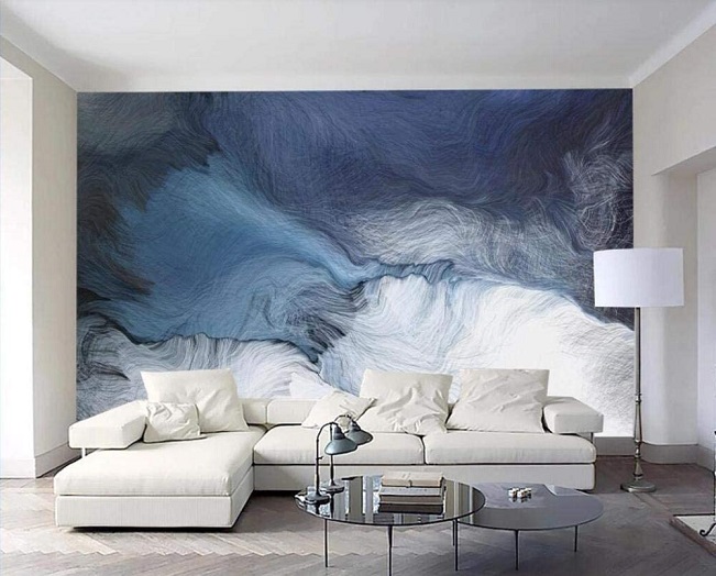
Blue
Blue tones are associated with calm and serenity. This is a superb colour for bedrooms, spas, or even bathrooms. Darker hues such as navy blue are great for adding a masculine feeling, while light blue hues are used to create a calming effect (bedroom, nurseries, etc.)
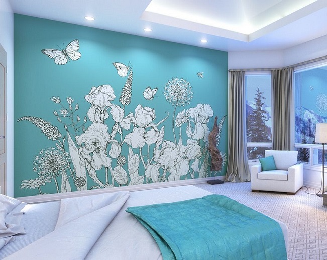
Green
We all think of nature when we see green. Deep green is associated with elegance and classiness, while lighter green is used to stimulate focus and creativity. Use this colour for a study or an office.
Yellow
This is the colour of the sun, associated with happiness, joy, energy and intellect. It’s great for dining rooms, kitchens and bathrooms. Use this colour in places where you want to add more light such as hallways. It is a wonderful colour for outdoor painting as well. It can be used as an accent colour in small quantities (details like vases, cushions, table cloth, one or two wallpapers if you want to put an accent on the walls).
Pink
Pink represents love, compassion, and nurturing. Depending on the tone, it can make the room playful and lovely. Dark hues might be tiring and shouldn’t be used in large amounts. This is a girly colour and is one of the most popular options for a girl’s bedroom.
Cover Walls With Wallpaper
Usually, people bring colour to their homes by changing their walls. If you aren’t quite sure if you’d like the new wall colour, you can start with wallpaper. Wallpapers were a huge trend in the 1970s and 1980s and they are still popular today. They are a lovely way to put an accent to a wall (above a fireplace, one wall in the room, accent wall with a mirror and so on). Use various colours and patterns of your choice. Add some serenity with blue wallpaper for walls in your bedroom, or turn your living room into a vigorous and brighter place with one or two walls with red wallpaper for example.
Cover Half the Wall
Let’s say you have decided to go with blue wallpaper. Cover half the wall from bottom to the half with it. This is a great way to make a change without overwhelming the room. It may look vintage but you will definitely refresh your room’s interior design. This a very classic look that never goes out style.
Feature Wall
A popular way to create a focal point is to apply wallpaper to one wall only. It will draw the eye to it and will create an accent spot. Go bold with something eye-catching or something gentle that would still be different than the rest of the walls. Make sure this wall is the only focal point, otherwise your eyes could easily get tired and the room may become overwhelming.